Confluence. The word literally means, “where two or more things merge”.
Confluence Cloud is synonymous with collaboration, the bringing together of ideas, documents, and resources. It should then come as no surprise that for projects such as the design and ongoing development of a knowledge base, Confluence Cloud is ideally suited.
Whether you’re building an internal or external facing knowledge base, the end goal is the same - helping your users help themselves. The knowledge base should be designed to function as a “self-serve” portal, allowing access without requiring personal assistance from you and your staff. This can be a huge driver for cost savings, as well as employee and customer satisfaction.
Consider the question, “How many steps do our employees (or customers) have to take to contact us to find the information they need?”
Engaging Pages Thanks To An Intuitive Suite of Macros
Taking the development process one step further, you need your knowledge base to be well-structured, highly efficient, attractive, and engaging. You need it to be more than just a basic document collection site. Search no further. Let us introduce you to the beautiful formatting macros found in Aura.
For every aspect of the layout of your knowledge base - background images or colors, dividers, panels, tabs, etc. - Aura has the tools to move your content to a new design standard. Many knowledge bases will include content such as Getting Started, a User’s Guide, and possibly Support. Rather than just basic text and hyperlinks, why not make the user experience exceptional and draw your users in visually.
Aura offers an intuitive suite of content macros that transform standard pages into beautifully organized content. The intuitive interface of the Aura macros will boost not only the user experience but also user acceptance throughout Confluence Cloud.
A Closer Look
Your knowledge base should not be constructed as a means to replace human interaction but to enhance and support it. It is there to assist your colleagues or your customers with getting answers to their questions.
With the Aura app installed (please see our article, “Titles, Buttons & Divider in Confluence with Aura” for details on installation) each of the included macros includes a configuration dialog window to fine-tune the look of each element. The WYSIWIG editor offers a live preview where all the respective parameters are customizable.
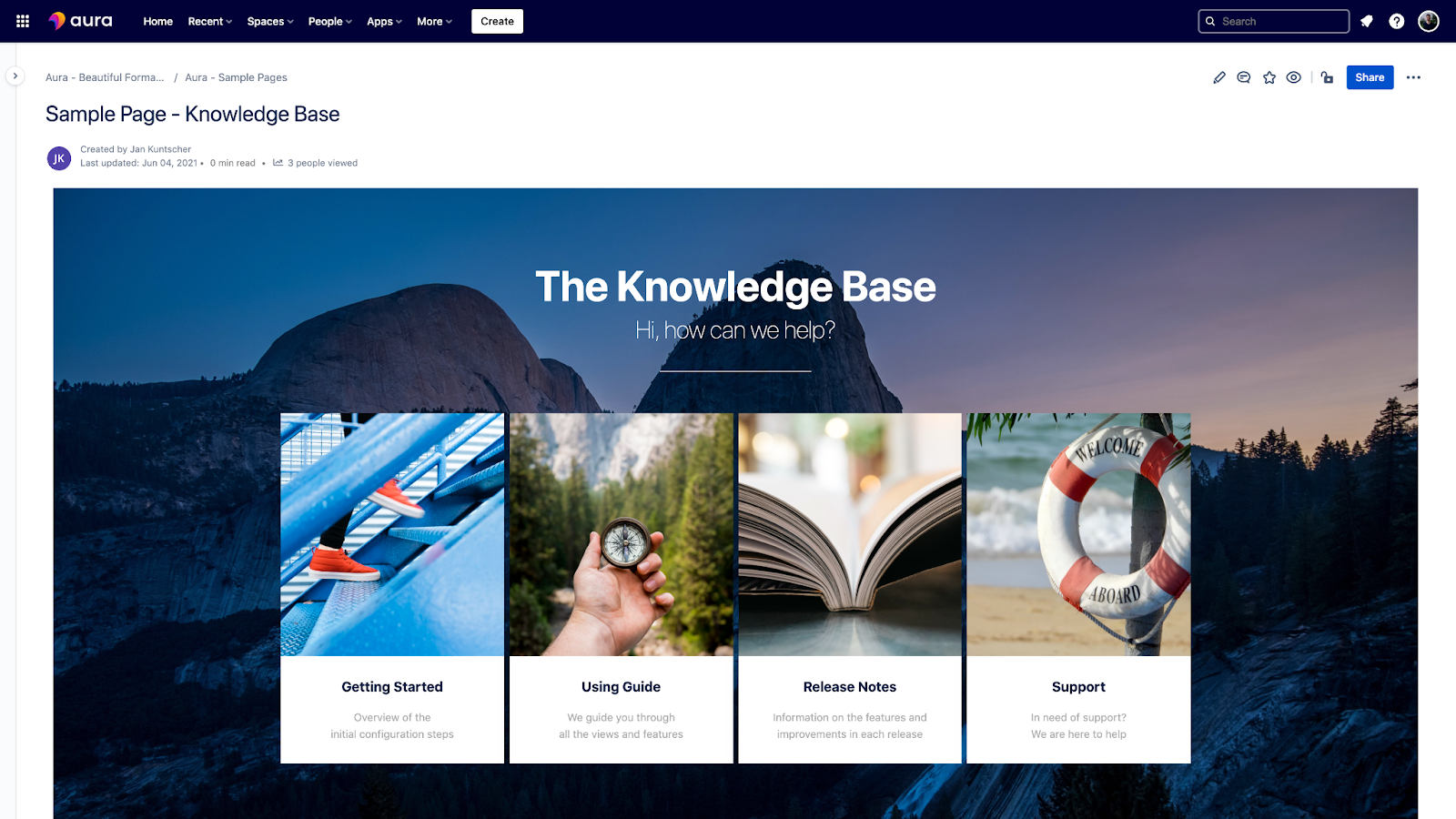
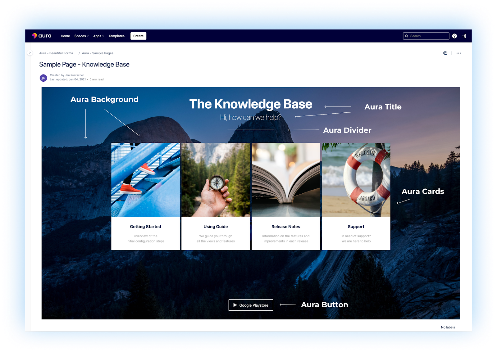
Looking at the Knowledge Base in the image above, a number of Aura macros were used to create this clean, non-cluttered look. An engaging image has been placed, edge to edge and top to bottom using the Aura Background Content macro. Rather than a blank white background, the use of a large, high-resolution photo sets the stage to help draw your user into the knowledge base.
With that attractive foundation in place, the Aura Title macro was called upon next to clearly call out the purpose of the page, “The Knowledge Base”, along with a sub-heading “Hi, how can we help?”. The sub-heading provides an informal, welcome, and a “call to action” for the user - help them help themselves. The size, color, font, alignment are all customizable within the macro settings.
Next, the Aura Divider was used to place a simple, subtle dividing line between the titles, and our next section which was made with Aura Cards. The Aura Cards macro allows you to create content boxes (cards) that are automatically organized by columns and rows to display your content in a more attractive, easy to read, and organized way. Everything from the content, hyperlink, color, and icon can be customized independently. Cards are an incredibly useful way to highlight specific topics, give a few sentences of context, and as with the Aura Background Content macro, add a relevant image to further draw the user in. And finally in our example, the Aura Button macro is called upon to easily hyperlink to additional content in the knowledge base, other Confluence pages, link to email addresses, even attachments.
The highlighted macros just scratch the surface of Aura’s capabilities to make your knowledge base the “go to” resource for your organization. There's also Aura Countdown to promote upcoming events or releases; Aura Progress to illustrate progress bars for initiatives, goals, and results; Aura Status to indicate everything from confidence votes, to scores, to star ratings and more.
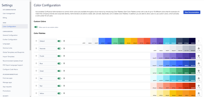
To further define and control “the look” of your knowledge base, your Confluence Cloud Administrators can control the colors and color palettes available for use. This can further help ensure consistency in the design of your knowledge base content. Each color palette comes with a set of up to 18 different colors that allow you to match your company’s brands and corporate identity.
Implementing all of these macros together helps improve the overall user experience. A more engaged user means they are more likely to find the information they need, return more often, and simply put, become more knowledgeable.
Interested? Find Out More
If you would like to learn more and see more examples and use cases, you can check out our website or the live demo within Confluence's environment. If you want to try out Aura directly, you can simply install the app in your cloud or data center system via the Atlassian Marketplace to test the solution at your leisure and in full.
We also offer Aura training remotely to give you a quick start in the world of Aura!
Feedback, questions, and constructive input are greatly appreciated by our development team!
Further Reading
- Titles, Buttons & Divider in Confluence with Aura
- Aura in Confluence: Make the functional beautiful
- Highlight Content in Confluence with Aura Panels
- Build A Help Center in Confluence with Aura
Learn more about Creative Commons licensing and //Seibert/Media
https://info.seibert-media.net/display/we/Seibert+Media+content+is+licensed+under+the+Creative+Commons


