Diesen Artikel auf Deutsch lesen
Welcome to the 5th part of our series "I 🧡draw.io"! Maybe you already know draw.io, the diagramming tool for Confluence and Jira: After all, it is the most installed app of its kind on the Atlassian Marketplace, with top ratings, and - like any good tool - has a real "fan base."
In our "I 🧡draw.io" series, we let the users tell us why they love the app so much and which features they particularly appreciate. Just follow us on social media if you're interested in more helpful tips and tricks!
Of course, you can also test the tool yourself: You can find draw.io here on the Atlassian Marketplace.
Preparing information correctly
Do you remember history lessons in school? All the dates, names, events; even worse if your teacher had a monotone voice… it was probably difficult not to fall asleep - let alone remember all that.
Or maybe you were lucky and your history teacher was someone who used pictures, timelines, infographics, etc. to convey history. Then maybe you might still know that Harald II lost to William the Conqueror in 1066, or that Homo habilis swung his hand axe about 3 million years ago, long before Homo erectus, Neanderthal, and Homo sapiens.
In the latter case, the teacher in question knew what everyone should know in the digital age: diagrams, flowcharts, and other visual representations are key to the success of any presentation. And draw.io is an excellent tool for creating diagrams (even those that can visualize the Stone Age)!
Visualize it - but how?
Vinh Nguyen, one of our users, described draw.io as a, "very useful and time-saving app. I usually use it to design games, but also for presentations and brainstorming. It helps to visualize things effectively."
However (let's face it), the diagrams you probably create for internal use are too complex for a PowerPoint or Keynote - too much information, a less-than-intuitive design, and color choices that will make the marketing team tear up...
The good news is that you don't have to conjure up diagrams out of thin air to get your audience excited. In fact, there are a few simple tweaks that can turn a "more-bad-than-right" diagram into a visualization that won't shy away from the spotlight.
Tip 1: Choose the right format
Let's take your initial diagram that you created in draw.io: How can you insert it into your presentation? It's very simple: all you really need is the "Export as" command, which can be found in the "File" menu.
Then you can save your diagram as a raster image (.png, .jpeg) or as a vector (.svg). Raster images are made up of pixels; they are suitable whenever accurate color and detail reproduction is important. They also work in any presentation software.
On the other hand, vector images are based on mathematical equations and can be resized without a loss in quality. However, not all programs accept .svg files (this may be problematic for example in Keynotes), but they are accepted in PowerPoint. In fact, it is benefitical to use .svg files when you work with PowerPoint since you can even finish editing a diagram directly in the presentation itself.
This functions as follows:
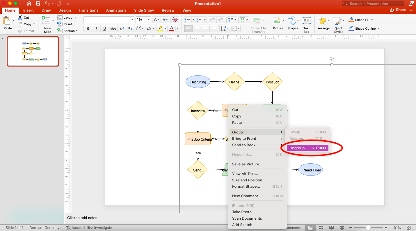
- Paste the .svg image on the slide.
- Right click and select the option "convert to shape."
- Right-click again and hover over the "Group" command and select "Ungroup."
That's it! Now the elements in your diagram will be converted into separate shapes, and just like any shape in PowerPoint they can be moved, scaled or recolored. It is very easy to change the diagram if needed at a later stage.
Tip 2: Break down complex diagrams with layers
Imagine your history teacher is covering the Battle of Hastings in great detail. It's exciting to learn how they made the knights’ armor, but with the wealth of information it is easy to lose your train of thought.
It is similar with presentation slides; in this case - less is more! Overloaded slides with complex diagrams on them are unbearable. The audience should be able to quickly understand the information in front of them. It's counterproductive for them to try to interpret a detailed diagram when they should be listening to you. The silver bullet: keep it simple and remove any information that doesn't support your story.
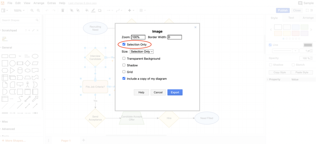
Fortunately, draw.io makes it easy to select specific parts of your diagram: Select the elements you want to show on a slide, then click "File -> Export" and choose ".png". Now select "Selected only" - and you're done. If you organize your charts by layers, this is a piece of cake.
The Battle of Hastings wasn’t simply two armies competing against each other and in the end one of them won. When it comes to something more complex, such as relationships, this can also be conveyed in your presentation with the help of diagrams: use multiple slides and build your diagram layer by layer.
For example, if it's a cause-and-effect diagram (also known as a fishbone diagram), you can outline the main problem and its causes on slide 1 and show the details of each cause on the following slides. This way, when you present the whole thing later, it will be easier for you to tell a story and guide your audience through the information in a structured way.

Tip 3: It's got the look - this is how your diagram becomes an eye-catcher!
On the battlefield, colors and coats of arms used to be pretty important - how else could you tell friend from foe? Colors and fonts also do a good job in a diagram: If everything doesn't disappear into a uniform gray, it's easier for your audience to understand information quickly.
As explained earlier, in draw.io you can select multiple elements - and change their design as a group. If you work with layers, use the same color for the same type of information, and generally choose high-contrast tones and clear fonts, you can turn a diagram with the complexity of a spaceship into an appealing and comprehensive visualization.
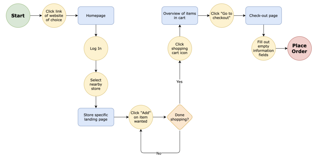
Of course, you can or even should customize the colors and font to match your company's look and feel (corporate design). Use custom shapes based on your logo and branding. But again, "less is more" - so limit the number of shapes, colors and fonts. Here's a great example:
Templates make life easier
Need to create brand new diagrams for your presentation? draw.io includes several templates that are great for different purposes, including lifecycle or timeline diagrams. There are also symbols available for any industry or use case. It is also possible to use draw.io to customize already existing diagrams as described above. Just think of the app as your "one-stop store" for visualizations in presentations.
How about you? Have you already worked with draw.io diagrams in your presentations? Then tell us about it: feel free to contact us via our social media channels!
We are continuously developing draw.io
Every single feature in draw.io is carefully thought out. It's more than just a piece of software. It's a tool designed to help real people collaborate in real-world scenarios. Our job is to make your job easier - that's draw.io.
We've made it even easier for you with tutorials and other tips in the form of videos, which are available on our YouTube channel. In our one-stop tutorial library, we also collect interactive tutorials and step-by-step instructions.
Want to go deeper? Then simply book a free, no-obligation demo and find out how draw.io can make your everyday work easier and more productive - not just yours, but that of your entire team.
And now: Happy Diagramming!
Further Reading
- All articles in the “I 🧡draw.io” series
- draw.io – What Does the Chevrolet Corvette Have to Do with Diagramming?
- Using the draw.io Board Macro during Agile and Scrum Meetings
- New eBook: Build a Sales Hub in Confluence Cloud
- Keep Your Customer Data in One Place in Confluence Cloud


